Friday, February 27, 2015
The Meaning Of Color
Does the use of color in your decor affect your mood and comfort?
Different colors have different
meanings. Colors have different psychological properties and depending on the
color can affect us many different ways. So yes, the use of color in your décor
does affect your mood and comfort.
House by the Shore wants
your coastal home to be relaxing, fun and a family friendly safe haven for you,
your family and any guests you may have. The colors you choose to put on your
walls and as décor may help you to relax, feel energized, or just be happy!
Colors are broken up into two
categories: primary and
secondary;

Blue –
The color blue is related to water and peace. It causes calmness and tranquility but
negatively represents coldness, fear, and masculinity. Blue is a constant in human life
(sky and water) and is the most common color in offices because it represents responsibility and
increases productivity.
Green –
The color green is mostly represented as money and is negatively known as envy,
jealousy, and guilt. It can denote nature, alleviate depression. Green represents new growth health and tranquility.
Purple –
Purple symbolizes royalty, nobility, spirituality, luxury, and
ambition. It represents artistic flair, is eccentric and unique. The color purple is negatively known
for mystery and moodiness.
Silver –
The color silver represents glamour and grace. It often reflects high tech and sleekness. Silver is negatively known to mean a dreamer and insincerity.
Red –
Red is of course the color of love. It evokes passion and strong emotions. It is
intense and increases appetite which is why you'll see it in so many restaurants. Red represents drama, charisma, determination, bravery and is optimistic. The negative meanings are anger, danger, and red serves us as a warning.
intense and increases appetite which is why you'll see it in so many restaurants. Red represents drama, charisma, determination, bravery and is optimistic. The negative meanings are anger, danger, and red serves us as a warning.
Pink –
The color pink negatively means weakness, immaturity and if you’re a male
it represents femininity. Pink positively means caring, soft, gentle, compassionate,
healthy, happy, playful and sweet.
Yellow –
The color yellow is mainly a positive color. It causes happiness, energy,
creativity, intellect, inspiration, excitement, joy and warmth. Yellow stimulates
mental processes, the nervous system,and encourages communication. Negatively, yellow makes babies cry, causes fatigue, strain on the eyes and can represent
someone who’s irresponsible and unstable.
Orange –
The color orange represents spiciness, warmth, playfulness and
cheerfulness. It may represent someone who is exotic and playful. Orange reflects
excitement, enthusiasm, courage, confidence, friendliness and success. It
negatively represents ignorance, sluggishness and warns us to be cautious.
Gold –
Gold negatively represents greed and a dreamer. Positively, it
means wealth and prosperity. Gold represents someone who is traditional and
valuable.
Brown –
Brown pessimistically means dogmatic and conservative. Positively, it represents friendliness, longevity, stableness, reliability and nature. It is
earthy, organic, connected, and outdoorsy.
Tan/Beige –
In a negative aspect tan is dull, boring and
conservative. However, it is dependable, flexible, and can be crisp.
Gray –
The color gray may represent someone who is careful, modern,
Black –
The color black stands for protection, drama, class, formality, sophistication,
and sensitivity. It may represent someone who’s powerful, artistic, mysterious,
and meticulous. Black negatively represents death, evilness, and mystery.
White –
The color white is known to represent goodness, innocence, purity, freshness,
easiness, cleanliness, peacefulness and it is viewed as sterile. Unfortunately it
represents winter, the cold and distance and can be viewed negatively.

Saturday, February 21, 2015
How to Choose the Right Lamp
Choose the wrong size and it won’t matter how pretty the lamp is!
At House By The Shore, you’ve heard us
talk about scale before and basically that is what it boils down to again in
choosing the correct lamp for your space.
Too large or too small ant the proportions will all be off and as we
mentioned it just won’t matter how pretty the lamp is, it will just look
wrong. Your lamp has to be the right
size for the space. Here are some tips
to finding a lamp that is both stylish and the correct size.
Style – always important!
You want to choose a lamp that fits with the design elements
in

Scale and proportion
are critical!
A small lamp that is designed for a bookshelf will look
pretty odd on the end table next to the sofa in your family room. Keep scale in mind. If you have a large chest as a bedside table
you’re going to want a larger lamp.
Avoid looking up into
a light bulb!
There is nothing worse than sitting in your chair and looking
up into a glaring lightbulb. To know the
height you need, sit in the chair and measure from the table surface to your
eye level. Then you will want to choose
a lamp whose base to the bottom of the shade isn’t taller than this
number. For a bedside table you would do
the same thing from a sitting position.
Variety is the spice
of life!
You want a variety of light sources to not only provide
adequate lighting but also to increase interest. You don’t have to have a matching pair of
lamps, especially in the family room. In
the bedroom it is ok but they don’t have to be the same. However, if different they need to be the
same size and scale.
Change out lamps to
refresh your design!
It is true. Just
changing out your lamps can freshen up your whole design. People will wonder if you redid the whole
room! We tend to forget to update our
lamps and that is a mistake. Styles
change and there are some wonderful new designs, colors and patterns available
in lighting today.

Friday, February 13, 2015
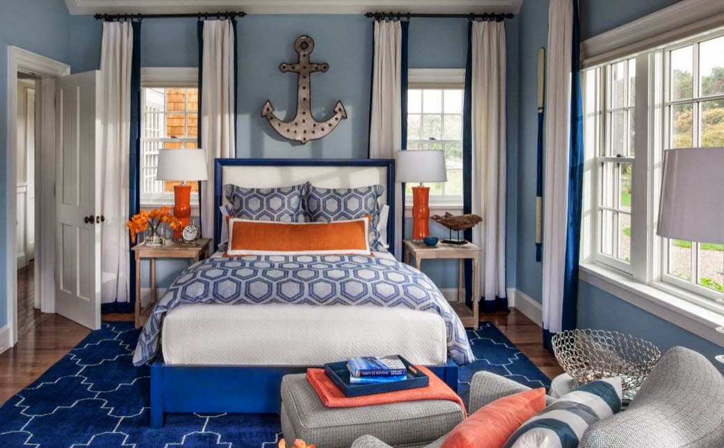
Blue & Orange Nautical Inspiration
Navy blue and pops of bright orange!
When you think nautical navy blue immediately comes to mind
of course but you don’t always think about adding orange as the accent. We love the blue and orange nautical inspired
guest bedroom in the HGTV
2015 Dream Home.
 |
| Photo Source: HGTV Dream Home 2015 - Guest Bedroom |
 |
| Photo Source: HGTV Dream Home 2015 - Guest Bedroom |
We took cues from them for a little inspiration
and recreation of our own.

Our idea board features the following products from House
By The Shore: Big
Mouth Vase Lamp - Orange, Brady Clock,
Lex
Anchor Wall Décor – Step of 3, Berne
Drift Wood Sculpture, Davidson
Aluminum Coral Bowl – Set of 2, Camotes
Seagrass Ottoman, Assisi Tile
Navy Rug, Hyannis
Stripe Pillow, and Visions
II Lobster Orange Pillow.
Saturday, February 7, 2015
Coastal Kitchens
Incorporating Coastal Style Into Your Kitchen
The temptation to go overboard in coastal décor is always
present. There is a fine line between
coastal style and going overboard with kitsch.
At House By The Shore, we believe the
key lies in the details and it is a situation where sometimes less is
more. We’ve pulled together some ideas
that we love and believe illustrates our point.
 |
| Photo via HGTV |
We’re in love with the 2015 HGTV Dream House - we’ll just throw that out there in the
interest of full disclosure. In our
defense, we think you’ll agree interior designer, Linda Woodrum really got this
one right. The clean lines and open
layout really represent how families live today. Yet the stunning wood floors and white batten
board clad ceilings and walls scream elegant coastal style. The bright white keeps the kitchen fresh
while the pops of blue again echo coastal style. Check out these photos
to see for yourself!

So what are the
lessons here to be learned?
One – your coastal kitchen should function just like your
kitchen inland. Think about how your
family uses the space and keep this in mind.
The HGTV kitchen has a great open layout that will function wonderfully
for entertaining.
Two – choose your color palette carefully. This is a great way to bring in coastal style. While the designer here chose all white the
warmth of the wood floor, the island countertop and the island stools function as
another color. The shiny silver of the
metals and the pop of blue act as accent colors.
Three – don’t overdo the coastal décor. This kitchen would be beautiful anywhere and
doesn’t scream nautical yet the wood of the island countertop makes you think
of boats and blue and white are definitely coastal colors.
Four – you don’t have to have pendant lights. The recessed lighting and light from the doorway,
windows and skylight are more than sufficient for this kitchen. Pendant lights over this island would
actually distract from the clean lines and the view of the hood and stove from
the family room.
 |
| Photo via HGTV |
For more great ideas for coastal kitchens, check out our coastal
kitchens board on Pinterest!
House By The Shore's Blog Policy
House By The Shore's Blog Policy
Subscribe to:
Posts (Atom)

