Showing posts with label color. Show all posts
Showing posts with label color. Show all posts
Sunday, July 19, 2015
Back To Campus Essentials
It's that time of the year again.
House By The Shore can help make your new place feel just like home!
Let's start with the basics:

A Great pair of sheets with easy care that are designed with comfort in mind. You will need plenty of good sleep to keep up with classes, studying and the occasional parties :)
Bath towels that are soft, comfortable and in fun colors to help you kick your day off right.
Proper lighting is a must have and at the correct height for your desk so there's no glare in your eyes for those late nights of cramming. We have lamps that match our storage boxes too - check out the Essentials lighting options we have.
Storage is essential to throw things in before your friends and family come to visit. Our Essentials Storage & Book Boxes are fun, colorful and built to last. They come in sets of 3.

Carry your items to class in style with our Sailor Bags:
Our Sailcloth Back Packs are tough stuff with three large compartments.Plus handy interior pockets to keep small items like cell phones, iPods,
and keys organized and easy to find.
 Easy access mesh outer pockets hold water
bottles, shoes or gloves. Great for school: Enough room for textbooks,
notebooks and binders, along with sports gear or outerwear and lunch.
Waterproof linings keep wet clothes separate from books and papers.
Wide padded
shoulder straps and padded back panel for all day comfort.
Easy access mesh outer pockets hold water
bottles, shoes or gloves. Great for school: Enough room for textbooks,
notebooks and binders, along with sports gear or outerwear and lunch.
Waterproof linings keep wet clothes separate from books and papers.
Wide padded
shoulder straps and padded back panel for all day comfort.Our Sailcloth Computer Bags are great for taking your laptop to class or study sessions. With a padded compartment that fits up to a 17" laptop, an interior section that zips closed for the most important files and two slip in side pockets big enough for files or magazines, there is just tons of room in this sleek, nautical bag. And all of this storage has our waterproof linings and is covered in durable sailcloth to protect your computer. Fold away 'tote' type hand grips and a comfortable shoulder strap.
And finally after a long day of classes your study sessions don't have to be stressful, curl up with a favorite throw and pillow that reminds you of home and have a few extra with lots of color to let your personality shine though.

House By The Shore's Blog Policy

Friday, May 29, 2015
Upscale Coastal Teal Bedroom
Coastal Inspired Guest Bedroom
House by the Shore is delighted to give you inspiration for a guest bedroom or even a
master bedroom make over. This upscale coastal teal bedroom was
inspired by coastal design and spa like features. Taking a cue from the
beautiful turquoise waters of the sea and adding in a little sparkle and glam,
this bedroom is elegant but comfortable.
 |
| Find more coastal inspiration on our Pinterest boards! |
The upscale coastal
teal bedroom features furniture and products all from House
by the Shore! The first item for the makeover was the Coral
Bedroom Rug in Silver. This rug is the perfect statement
rug of a soft color with a bold boarder of a coastal coral print. The beautiful
shade of gray will help anchor the furniture in the bedroom.
 |
| Multiple Sizes |
 |
| Multiple Sizes and Custom Finishes |
The Pencil Post Bed is a classic and
timeless piece that is perfect for any room. This bed is custom made and you
can choose the paint color or type of finish. Comes in all sizes and
worthy of passing down to generations to come!
Add a pop of bold pattern, but
relaxing color with the Kabuki
Duvet
Set in Teal. This duvet set adds a fun
print and the calming color reflects the waves of the ocean outside your
coastal home.
 |
| Multiple Sizes Available |
 |
| Accent Furniture |
Use the Essentials Reflective Ottoman as an
accent piece of furniture to add a touch or color and pattern to the room. It's
also a useful piece of furniture for seating to put on shoes (who doesn't love
looks and function?) Not to mention, very on trend today.
Hang the Piper Round Mirror set above the bed or
over a chest for a fun take on mirrors and to add a golden metallic touch to
the room that guests will love. We love the fun shapes and this modern twist
coupled with the more traditional bed.
 |
| Coastal Decor - Mirrors |
 |
| Home Decor - Lighting |
Every room needs multiple
lamps and can't you just see a pair of these on either side of the bed. Add a
touch of glamour to this beautiful upscale room with a pair of these Silvertone Glass Mercury Lamps.
A pair of lamps of course
need a pair of tables! Let your lamps shine upon a gorgeous pair of
tables with the Parma Side Table. We're just crazy about
these pieces and love mixing metals and styles. This is what adds
personality to any room.
 |
| Accent Furniture - Side Table |
Thursday, March 26, 2015
Make Everyone Green With Envy
Add Accents in Shades of Green to your Coastal Home
House by the Shore wants
to celebrate bright and dark green accents in honor of spring. Pantone
Spring 2015 has 3 shades of green that are perfect for spring coastal
homes but also year-round for year round living. Because green is the color of nature and it
has a strong emotional tie to safety, it is a good color to use in homes.
You can add fresh bright accents
in Lucite
green, dark green accents in
Treetop, or more neutral colored
green accents in Woodbine.
Lucite Green is a bright and
fresh airy color similar to mint. It’s a relaxing and soothing color that can
add a punch of color to any room. Pair it with corals, blues, or silver/grays
for a coastal feel.

Treetop green is a dark natural
green just like the leaves on a palm tree. Use treetop as a background color
for accent colors such as neutrals, browns, dusky blues, and grays.

Woodbine is the shade of green to
act as a neutral and add a tropical edge to any Coastal home. Colors such as
lavender, silvers, browns, blues, and almost anything work with this natural
neutral color of yellow-green.

Friday, February 27, 2015
The Meaning Of Color
Does the use of color in your decor affect your mood and comfort?
Different colors have different
meanings. Colors have different psychological properties and depending on the
color can affect us many different ways. So yes, the use of color in your décor
does affect your mood and comfort.
House by the Shore wants
your coastal home to be relaxing, fun and a family friendly safe haven for you,
your family and any guests you may have. The colors you choose to put on your
walls and as décor may help you to relax, feel energized, or just be happy!
Colors are broken up into two
categories: primary and
secondary;

Blue –
The color blue is related to water and peace. It causes calmness and tranquility but
negatively represents coldness, fear, and masculinity. Blue is a constant in human life
(sky and water) and is the most common color in offices because it represents responsibility and
increases productivity.
Green –
The color green is mostly represented as money and is negatively known as envy,
jealousy, and guilt. It can denote nature, alleviate depression. Green represents new growth health and tranquility.
Purple –
Purple symbolizes royalty, nobility, spirituality, luxury, and
ambition. It represents artistic flair, is eccentric and unique. The color purple is negatively known
for mystery and moodiness.
Silver –
The color silver represents glamour and grace. It often reflects high tech and sleekness. Silver is negatively known to mean a dreamer and insincerity.
Red –
Red is of course the color of love. It evokes passion and strong emotions. It is
intense and increases appetite which is why you'll see it in so many restaurants. Red represents drama, charisma, determination, bravery and is optimistic. The negative meanings are anger, danger, and red serves us as a warning.
intense and increases appetite which is why you'll see it in so many restaurants. Red represents drama, charisma, determination, bravery and is optimistic. The negative meanings are anger, danger, and red serves us as a warning.
Pink –
The color pink negatively means weakness, immaturity and if you’re a male
it represents femininity. Pink positively means caring, soft, gentle, compassionate,
healthy, happy, playful and sweet.
Yellow –
The color yellow is mainly a positive color. It causes happiness, energy,
creativity, intellect, inspiration, excitement, joy and warmth. Yellow stimulates
mental processes, the nervous system,and encourages communication. Negatively, yellow makes babies cry, causes fatigue, strain on the eyes and can represent
someone who’s irresponsible and unstable.
Orange –
The color orange represents spiciness, warmth, playfulness and
cheerfulness. It may represent someone who is exotic and playful. Orange reflects
excitement, enthusiasm, courage, confidence, friendliness and success. It
negatively represents ignorance, sluggishness and warns us to be cautious.
Gold –
Gold negatively represents greed and a dreamer. Positively, it
means wealth and prosperity. Gold represents someone who is traditional and
valuable.
Brown –
Brown pessimistically means dogmatic and conservative. Positively, it represents friendliness, longevity, stableness, reliability and nature. It is
earthy, organic, connected, and outdoorsy.
Tan/Beige –
In a negative aspect tan is dull, boring and
conservative. However, it is dependable, flexible, and can be crisp.
Gray –
The color gray may represent someone who is careful, modern,
Black –
The color black stands for protection, drama, class, formality, sophistication,
and sensitivity. It may represent someone who’s powerful, artistic, mysterious,
and meticulous. Black negatively represents death, evilness, and mystery.
White –
The color white is known to represent goodness, innocence, purity, freshness,
easiness, cleanliness, peacefulness and it is viewed as sterile. Unfortunately it
represents winter, the cold and distance and can be viewed negatively.

Friday, February 13, 2015
Blue & Orange Nautical Inspiration
Navy blue and pops of bright orange!
When you think nautical navy blue immediately comes to mind
of course but you don’t always think about adding orange as the accent. We love the blue and orange nautical inspired
guest bedroom in the HGTV
2015 Dream Home.
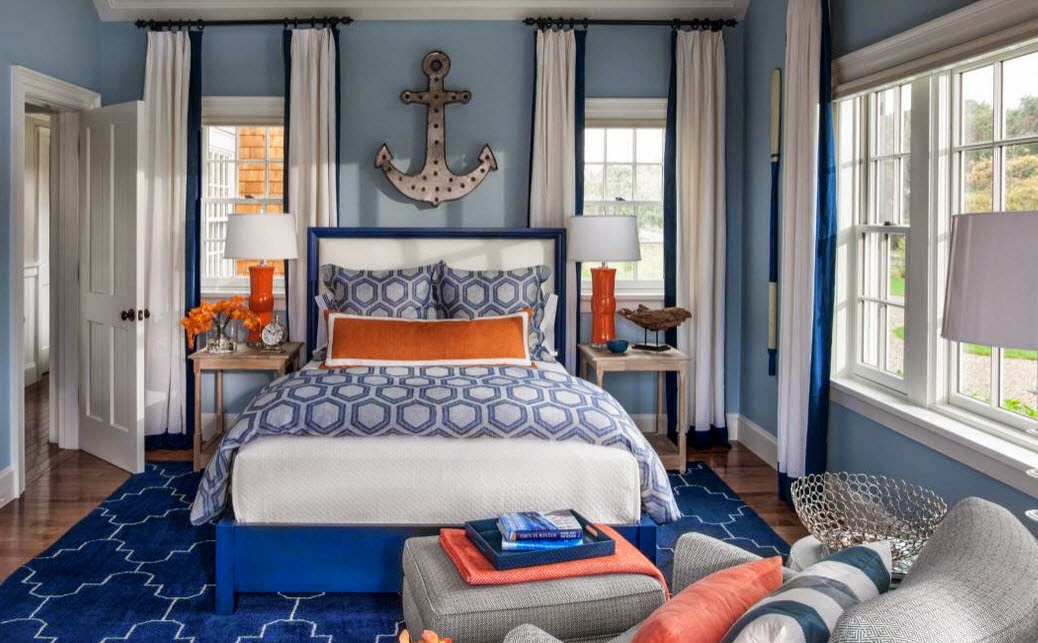 |
| Photo Source: HGTV Dream Home 2015 - Guest Bedroom |
 |
| Photo Source: HGTV Dream Home 2015 - Guest Bedroom |
We took cues from them for a little inspiration
and recreation of our own.

Our idea board features the following products from House
By The Shore: Big
Mouth Vase Lamp - Orange, Brady Clock,
Lex
Anchor Wall Décor – Step of 3, Berne
Drift Wood Sculpture, Davidson
Aluminum Coral Bowl – Set of 2, Camotes
Seagrass Ottoman, Assisi Tile
Navy Rug, Hyannis
Stripe Pillow, and Visions
II Lobster Orange Pillow.
Saturday, January 24, 2015
Strawberry Ice Inspirations
Strawberry Ice – 2015 Color Trend for Spring
In the throes of winter, we often look forward to spring and
this cheerful color is sure to be a favorite.
Pantone® has
chosen strawberry
ice as one of their picks for spring color trends. Their color choices for the season are a
cooler and softer color palette that takes its cues from nature. At House By The Shore, we believe this
is a great coastal color. You see it in
everything from sunrises and sunsets to shells, coral and even shrimp. For us, it only makes sense to bring it into
your coastal home décor and well, into your clothing and makeup too. As Leatrice Eiseman, Executive Director of
the Panetone® Color Institute puts it, “both tasty and tasteful, Strawberry Ice
is a confection color that evokes a feeling of being ‘in the pink,’ emitting a
flattering and healthy glow.”
We think you’ll be seeing a lot of this color
and we already are. Here are just a few
of the things we’ve found that we just love!

Photos: Pantone®
Strawberry Ice, Clique
Shops – Phone Case, Up
Country Pink Gingham Dog Collar, Essie Guilty Pleasures Nail
Lacquer, NYX
Lipstick – Indian Pink, House
By The Shore Fish Bench, Lilly
Pulitzer Janice Shift Dress – Pink Salmon, House By
The Shore – Pelican Bed, HGTV
Dream Home – 2015, Kate
Spade Vegas Jewels Drop Earrings – Deco Rose, and House
By The Shore Sea Gate Pillow – Hibiscus.
House By The Shore's Blog Policy
House By The Shore's Blog Policy
Wednesday, January 7, 2015
Marsala
2015 Color of the Year
Well it’s official. The
Pantone Color Institute®
has chosen the color of the year! Marsala
(Pantone 18-1438) is a warm rich red-brown that appeals to both women and
men. Pantone
states in the explanation of why Marsala that “Much like the fortified wine
that gives Marsala its name, this tasteful hue embodies the satisfying richness
of a fulfilling meal while its grounding red-brown roots emanate a
sophisticated, natural earthiness.”
The color is flattering to many skin tones which will make
it a winner for beauty products but it is also flattering to home décor. Rich, warm and grounding it will deliver a
lot of warmth to interiors whether you paint your walls with it or choose to
use it as a pop of color.
We wanted to share with you some of the things we at House
By The Shore love in this warm rich color!

Image Source: (1) Day-Date Watch
from Rolex, (2) Simple
to Foresee Dress from ModCloth, (3) Coral
Bouquet Canvas from House By The Shore, (4) Peggy Mid-Century
Sofa from West Elm, (5) Color-Cut Cake
Stand from Anthropologie, (6) Panetone Color of the
Year 2015, (7) Cheers
to Marsala!, (8) Old
Point Armoire from House By The Shore, (9) Chuck
Taylor Fresh Colors by Converse, (10) Marsala
Dog Bow Tie from LADogStore, and (11) Tulle
Underwire Top from J.Crew
House By The Shore's Blog Policy
House By The Shore's Blog Policy
Friday, January 2, 2015
Moody Blue Board
2015 color trends for home décor are pointing to blue as a prominent color.
As we move forward into 2015, we thought we’d take a moment
to share with you some things that inspire us.
This board is devoted to blue which will be prominent in home décor for
the New Year according to House
Beautiful. We love blue and
think it is a lovely color to use in coastal décor. It is such a natural fit since it is the
color of the sky and sea. According to Color Wheel Pro,
“Blue is considered beneficial to the mind and body. It slows human metabolism and produces a
calming effect. Blue is strongly
associated with tranquility and calmness.”

Photos: Maine
Blue & White Jug, Nautical
Life Needlepoint Belt, Nautical
Style Guest Bedroom, Capri
Pillow – Indigo, Blue
Crab Print, Fish
Bunkbed, France
Blue Round Dutch Oven, Blue
Family Room, Blue
Gingham Dress
Friday, October 24, 2014
Mixing Patterns Like the Pros
How do you mix patterns like the pros?
House By The Shore is
often confronted with this question and many more when it comes to
patterns. How do you mix them? What is the secret to mixing patterns? How many patterns can you have? It really boils down to some fairly simple
tips when it comes to mixing patterns in your home décor.
 |
| Hadley Boxes - Set of Three |
It is all about odd numbers and scale. Actually this is the secret to all design but
let us explain. Odd numbers are more interesting to us visually. It is better
to have three of something rather than 2 or 4 whether it is the number of
patterns you use or how many knick-knacks you have grouped on a shelf. Don’t believe us? Take a look at the picture. We bet your answer is three.
Scale is also vitally
important. You can’t use 5 patterns that
are all bold – it will drive you crazy.
When people get patterns wrong it is because they forgot about
scale. Here are some tips and visual
cues we suggest following when mixing patterns.
Minimum of three!

Fabric number two should be half the scale of your dominant fabric and contain some of the colors used in your main pattern. We chose a lovely check fabric – Outer Banks – Robert Allen Fabrics Oasis which picks up the teal and green nicely.
Fabric number three focuses in on one color – turquoise. It is actually a plaid, Helios Plaid – Robert Allen Fabrics Turquoise. Your third fabric should be the smallest in patter and typically will have fewer colors. Now we could have chosen a fabric that has more than two colors but we would have wanted the scale to be even smaller as the colors will compete with the scale.
The more the merrier!

The more patterns you use the more interesting your look. The key here as you add in more pattern is to keep the same color intensity and you also want to be sure you spread the pattern around the room.
When we added the fourth fabric we kept it light and went with a stripe. This Ticking – Bella Dura – Aquamarine fabric brings out the creamy white and gray in fabric one.
The fifth fabric, Rowell – Robert Allen Fabrics Pool is a small scale geometric that accentuates the turquoise color.
Solids count!
When you are working
with mixing patterns, you want to remember that solid colors are patterns too
and that texture plays a role. Look at
how nicely the solid turquoise,
gray
and green
fabrics balance the patterns we have chosen.
Now we hear you, they have eight now.
We would stop at seven or pull something else in and move to nine but we wanted to illustrate the solid color choices you could go with here. You actually could have more than three; you could use the creamy white and navy as well.

Hard to get too many!
Ok, we suppose it MIGHT be
possible to get to the point where you have too many but let’s just say we
haven’t discovered it yet. That is as
long as scale is kept in mind. You’re
more than likely going to run out of places to put the patterns before you hit
too many patterns. After all a room will
only hold so many upholstered pieces, draperies and throw pillows! And remember some of your patterns will be used minimally like the piping on a chair or pillow.
House By The Shore's Blog Policy

Friday, October 10, 2014
Coastal Colors - Going Tropical with Confidence!
Amazing Coastal Colors

The tropics are dazzling with color and when you have a
house by the shore it is only natural to be drawn to bolder and more
adventurous colors. How to use them in
your décor without overpowering it is an art in itself but we find all too often
that people shy away from these gorgeous colors simply because they’re afraid
to put them on a wall or even a piece of furniture for that matter. No one should be afraid of color; the world
is not black and white people. Just
think how incredibly boring it would be!
Ok, we hear you cringing at the thought. We can even agree that when you’re standing
in an empty white room and you open that can of bright green paint and put the
first swipe on the wall if you’re brave enough to get that far it is a very
scary thing. You’ll be second guessing
yourself like crazy and if you’re not, someone else will be. The thing is the walls are only one component
of the room and until you get your rug down, your furniture in the room and
your accessories displayed it will look wrong.
It takes all the pieces of the puzzle to complete the picture.
Here are a few tips we follow and hope they will give you
some inspiration and calm your nerves.
If you don’t see it in nature – DON’T
use it.
The trick to using bright colors is to use natural color
combinations. Elaine Griffin, Better Homes

If you don’t trust your eye – turn to
math.
There is such a thing as a 60-30-10 rule of decorating. What?
We know but believe us it actually works. If you don’t believe us pick up any
decorating magazine and analyze the rooms you see. This rule actually comes from the Greek
formula for Phi (pronounced “fee”). This
formula determines the perfect ration of 1 to 1.61803399. Ok, don’t panic! You don’t need your calculator to figure this
out. Basically the premise is that you
can divide a space using the ratio proportions and the end result will always
be pleasing. In decorating, designers
apply Phi to rooms as a whole, furniture placement, color and accessories
according to the article Interior
Decorating and the Golden Mean by Home Decorating and Staging.
The 60-30-10 rule is about percentages and when you apply it
to color it works this way.
Approximately 60% of the room should be the dominant color. The secondary color would be 30% and the
accent color would be 10%.
For instance in applying this rule to a room the 60% might
be the wall color. The 30% might be the
color used in furnishings and draperies and the 10% might be accent pillows or
artwork. If you’re not mathematically inclined
– don’t worry about it. We naturally are
drawn to this ratio and you’re probably doing it without ever knowing you were.

Remember art class and the color wheel? It is a useful tool especially if you can
never decide if teal will look good with coral.
It does by the way. If you’ve
forgotten your color theory, you can take a quick refresher with Color
Matters and read up on basic
color theory.
As a refresher there are analogous colors (any three colors
that are side by side on the color wheel), complementary colors (any two colors
directly opposite of each other) and color schemes based on nature. Our premise (and we aren’t the only ones) is
that if it works there, it will work anywhere.
Get a little help from technology!
You’ve heard there is an app for that? Choosing paint color is no exception. We are absolutely in love with Sherwin
Williams and their Chip It! Tool. You can upload any photo – one you take or
one you find online and voila it will give you the paint colors. You can truly
take your cue from nature!
Where do you start in choosing color?
If you have already picked out something for the room and
don’t know what colors to paint. Take a
picture of it and use the Chip It tool.
You’ll have your palette right away.
If you don’t have any idea which way to go there are a
couple of things you can do. Flip
through decorating magazines and don’t think just react. Each time you come to an image you like, cut
it out. Lay them all out on the
table. You’ll see a pattern. You will tear out things that speak to
you. You’ll notice repeating colors and
repeating patterns.

Go to your closet and just stand there. What is the first color you see? It is probably your favorite. If you like to wear it you’ll like to live in
it unless you have a wardrobe of all black anyway.
Look out the window.
What colors are reflected in the nature around you? Take a picture and use the tool – there is
your palette. Coastal homes in
particular look astonishing when you bring the brilliance of the outdoors
in.
Don’t forget the POP!
And we don’t mean soda.
Every room needs a pop of color to make it stand out. The pop of color
We know, it sounds backwards but it is true. If you put on a pair of black pants and a
white blouse it looks classic right? But
if you add a red scarf or a bold gold necklace, you’ve taken your ho-hum outfit
to a different level right? It is the
same for your rooms.
actually brings everything together and gives your eye a place to rest.

actually brings everything together and gives your eye a place to rest.

Subscribe to:
Posts (Atom)

